(Use the graph of the wheat market in Economic Insight 9.1, on p. 162 of the text.) S1 shows the supply curve for wheat in the local market. S2 shows the supply curve for wheat in more distant markets in the early 1800s. S3 shows the supply curve for wheat in more distant markets in the mid-1800s. Given the information provided, we can conclude that
a. the price that wheat producers received per bushel rose from P2F to P2C during the antebellum period.
b. the price paid by wheat buyers in distant markets fell from P2C per bushel to P3C per bushel during the antebellum period.
c. in the mid-1800s, wheat buyers in distant markets paid P3F per bushel and wheat producers received P3C per bushel.
d. wheat producers received a price of P3C for wheat in the early 1800s.
b. the price paid by wheat buyers in distant markets fell from P2C per bushel to P3C per bushel during the antebellum period.
You might also like to view...
Because the short-run average total cost curve slopes downward for an information product, the firm experiences
A) a downward sloping marginal cost curve. B) a downward sloping average variable cost curve. C) short-run economies of operation. D) long-run diseconomies of scale.
An example of an excise tax is the
a. poll tax on every citizen b. property tax on real estate c. corporate income tax d. property tax on personal belongings e. unit tax on a movie ticket
A competitive firm sells 100 units of output for $5 per unit. The firm's marginal revenue amounts to __________
Fill in the blank(s) with correct word
Refer to the accompanying figure. A decrease in demand is represented by a shift from: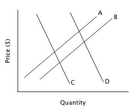
A. curve D to curve C. B. curve B to curve A. C. curve A to curve B. D. curve C to curve D.