Provide an appropriate response.Shortly before an election, a market research firm took a poll to find out whether people were planning to vote for or against a particular ballot measure. The results are shown below.  Against3087In favor3691Undecided910The ballot measure will pass if a simple majority (more than 50%) vote in favor of the measure. You wish to construct a graph to represent the data. It should be easy to see from your graph whether more than 50% of the people are planning to vote in favor of the measure. Which graph would be more useful, a bar graph or a pie chart? Explain your thinking.
What will be an ideal response?
Answers will vary. Possible answer: A pie chart would be more useful. A pie chart is useful for comparing the size of each category with the whole (ie the proportion of the whole population falling in each category). A bar graph is more useful for comparing the sizes of different categories with each other.
Mathematics
You might also like to view...
Find the value of the function.Given f(x) =  , find f(3).
A. - 
B. Undefined
C. 1
D. 
Mathematics
Graph the equation by determining the missing values needed to plot the ordered pairs.x + 3y = 6; (0, ), ( , 0), (1, ), ( , 1)
A. 
B. 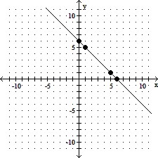
C. 
D. 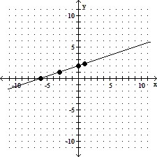
Mathematics
Solve the equation.-6 = m - 25
A. m = 31 B. m = -31 C. m = -19 D. m = 19
Mathematics
Find the numerical value of the expression for the given value. , x = 3
A. - 
B. - 
C. 
D. 
Mathematics