Create a graphical display for the data given. You may choose any graphic type that you feel is appropriate. Write a few sentences explaining why you chose this type of display and a few sentences describing any interesting patterns in the data.The table below shows the population by year for various countries. Population is given in millions. 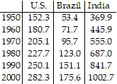
What will be an ideal response?
Answers will vary. One possible answer: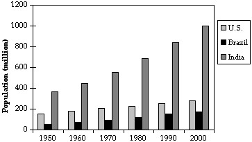
The multiple bar graph distinguishes the three categories. India's population has been growing at a much higher rate than the U.S. or Brazil
You might also like to view...
Match the surface show below to the graph of its level curves.
A. 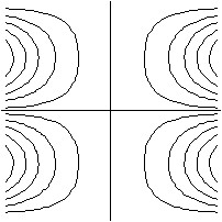
B. 
C. 
D. 
Solve the problem.Tim and Judy mix two kinds of feed for pedigreed dogs. They wish to make 54 pounds of feed worth $0.28 per pound by mixing one kind worth $0.24 per pound with another worth $0.42 per pound. How many pounds of the cheaper kind should they use in the mix?
A. 42 pounds B. 22 pounds C. 32 pounds D. 12 pounds
Solve the problem.An investor buys a $20,000 T-bill at a 7% discount for 26 weeks. Find the effective interest rate. (Assume 52 weeks per year.)
A. 7.25% B. 5.45% C. 10.50% D. 3.63%
The table shows the number of votes received by each candidate in the last election. Candidate Votes Mr. Olsen 2078 Ms. Li 3760 Mr. Barone 2780 Ms. Vaporis 3706Write the number of votes received by Ms. Vaporis in expanded form.
A. 3000 + 700 + 6 B. 3700 + 6 C. 3000 + 70 + 6 D. 300 + 70 + 6