In the above figure, the axis breaks are used
A) to create a misleading graph.
B) to indicate that there are jumps from the origin, 0, to the first values recorded along the axes.
C) to indicate that there are not enough data to be included in the graph.
D) to show that there are no data available for the omitted ranges.
B
You might also like to view...
Most economists
A. favor both tariffs and quotas. B. consider tariffs less of an evil than quotas. C. consider quotas and tariffs of equal evil.
To move the allocation of resources closer to the social optimum, policymakers should typically try to induce firms in an oligopoly to
a. compete rather than cooperate with each other. b. collude with each other. c. form various degrees of cartels. d. cooperate rather than compete with each other.
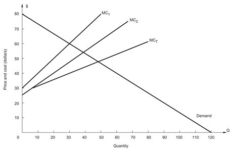 The figure above shows the demand and cost conditions for a firm with two plants. What is the profit-maximizing price?
A. $20 B. $30 C. $40 D. $50 E. $60
Using Figure 1 above, if the aggregate demand curve shifts from AD2 to AD3 the result in the short run would be: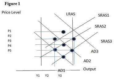
A. P1 and Y2. B. P2 and Y3. C. P3 and Y1. D. P2 and Y2.