In the bar graphs below, a projection of population by age groups and gender for two different countries is given as a percent of the country's population at the time. Provide an appropriate response.Population Pyramids for Countries A and B: 2006 and 2050
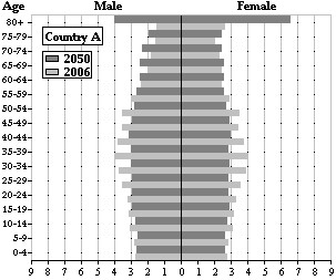
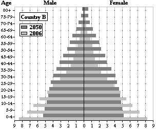 Which country has a much higher future projection for the 80+ age group? Explain this trend.
A. Country B possibly due to famine.
B. Country A possibly due to famine.
C. Country A possibly due to increased life expectancy.
D. Country B possibly due to increased life expectancy.
Answer: C
Mathematics
You might also like to view...
Find the limit using 
 = 1.
= 1.

A. 1
B. does not exist
C. 
D. 5
Mathematics
The circle graph shows the results of the student council presidential election. The complete circular area represents 100% of the votes.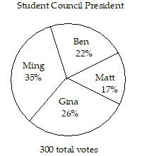 The circle graph shows what percent of the vote each person received.What percent of the votes did Matt and Ben receive together?
A. 61% B. 17% C. 22% D. 39%
Mathematics
Simplify the expression. Assume all variables represent positive real numbers.
A. 
B. 
C. 
D. 
Mathematics
Solve the equation.17 = 7x - 4
A. 6 B. 14 C. 18 D. 3
Mathematics