Answer the question.The bar graph below shows the number of car accidents occurring in one city in each of the years 1993 through 1998. The number of accidents dropped in 1995 after a new speed limit was imposed. Why is the graph misleading? How would you redesign the graph so that it is less misleading? What impression is conveyed by the graph?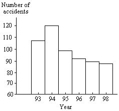
What will be an ideal response?
Answers will vary. Possible answer: The graph is misleading because it is truncated. The scale on the vertical axis should start at zero so that the bars will be in the correct proportions.
The truncated graph conveys the impression that the number of accidents fell by about 33% in 1995 when in fact the number of accidents fell by about 17%.
You might also like to view...
Read each combination value directly from Pascal's Triangle.
A. 40,320 B. 8 C. 10,080 D. 4
Solve the problem using the strategy of making a list or using a diagram.A coin is tossed five times. How many ways can it come up heads 4 times and tails once?
A. 2 B. 5 C. 3 D. 4
Express the number in decimal notation.7 × 10-7
A. 0.0000007 B. -700,000 C. 0.00000007 D. 0.000007
Factor.x2 + 2x - 63
A. prime B. (x - 9)(x + 1) C. (x - 9)(x - 7) D. (x + 9)(x - 7)