Which curve in the graph shown below best represents the data in the table?
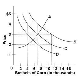
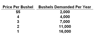
Refer to the following table which shows the quantities of corn demanded at various levels of corn price (hypothetical data).
A. A
B. B
C. C
D. D
Answer: C
You might also like to view...
Refer to the figure above. What is the deadweight loss when the market is converted into a monopoly?
A) $0 B) $45 C) $90 D) $180
In the following question you are asked to determine, other things equal, the effects of a given change in a determinant of demand or supply for product X upon (1) the demand (D) for, or supply (S) of, X; (2) the equilibrium price (P) of X; and (3) the equilibrium quantity (Q) of X. An increase in the price of a product that is a complement to X will
What will be an ideal response?
A move from I to L best represents a
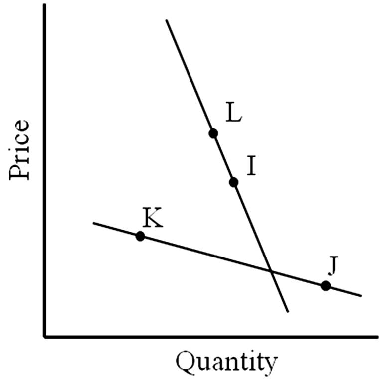
A. change in quantity demanded.
B. change in demand.
C. increase in demand.
D. decrease in demand.
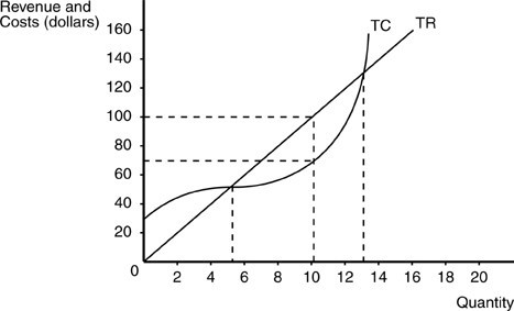 In the above figure, at output levels between 5 units and 13 units
A. the firm is breaking even. B. total revenue equals total costs. C. the firm's economic profits are positive. D. the firm's accounting profits are negative.