Aggregate demand and supply curves have been widely used to analyze the performance of the macroeconomy. Figure 5-3 shows four diagrams that represent different changes in the macroeconomy. Choose the diagram that best represents the situations described in the following questions.Figure 5-3
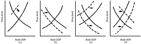
Which graph in Figure 5-3 best represents the favorable macroeconomy of the late 1990s?
A. 1
B. 2
C. 3
D. 4
Answer: D
You might also like to view...
All of the following can cause technological progress EXCEPT
A) population decreases. B) free trade. C) education. D) research and development.
Refer to the scenario above. The demand for Sporty's soccer balls is 2,500 units if ________
A) the price charged by Sporty is higher than the price charged by Go! B) the price charged by Go! is higher than the price charged by Sporty C) the price charged by Sporty is equal to the price charged by Go! D) the price charged by Go! is higher than the unit cost of producing a ball
If the consumption of a good or service by one person does not decrease the quantity available for another person, the good or service is
A) nonrival. B) nonexcludable. C) pure. D) free.
What is the price and quantity of coffee for the second-highest point on the market supply curve?
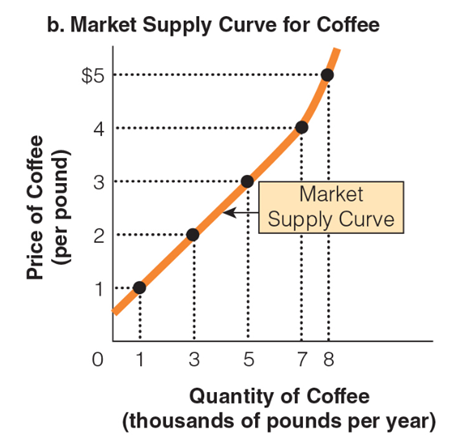
a. $3 per pound; 3,000 pounds of coffee per year
b. $3 per pound; 5,000 pounds of coffee per year
c. $4 per pound; 7,000 pounds of coffee per year
d. $5 per pound; 7,000 pounds of coffee per year