What does a labor supply curve represent? What does it look like?
What will be an ideal response?
A labor supply curve is a diagram that shows the quantity of labor supplied at different wage rates. Its shape depends on how households react to changes in the wage rate. It will typically slope upwards as long as the substitution effect dominates. However, there is a possibility that the labor supply curve could bend backwards at higher wages if the income effect dominates the substitution effect.
You might also like to view...
The fact that resources tend to be specialized is one reason the production possibilities frontier is drawn
A. bowed outward. B. bowed inward. C. as a straight line (but not horizontal). D. as a horizontal straight line.
Refer to the graph below. The solid kinked demand curve would most likely be observed by a firm operating within
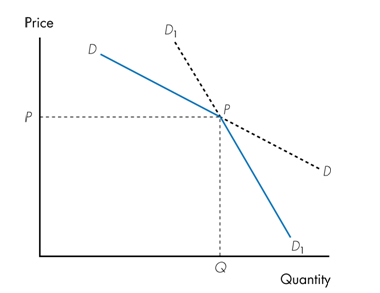
a. perfect competition.
b. pure monopoly.
c. an oligopoly.
d. monopolistic competition.
The International Monetary Fund has a "quasicurrency" called
a. the Special Drawing Right. b. the Voluntary Export Restraint. c. the Monetary Trilemma. d. the Euro Dollar.
To control moral hazard on the providers' side of the market and the increased spending that accompanies it, managed care organizations enter into contracts with providers that include all of the following except:
a. risk sharing. b. case management. c. the ability to deny coverage to high-cost users. d. utilization review. e. capitation.