What guidelines should you follow to improve the clarity of your line charts?
What will be an ideal response?
Use the following guidelines when creating line charts to improve your presentation:
• Use a line chart only when there are more than five or six values. If there are only a few data points, the chart will look incomplete.
• Use different symbols for each data set. One data set might indicate data points as small circles, and another data set might have data points as small triangles. Make sure the symbols are similar in size for the different data sets and thicker than the line so that they are easily discernible. Include a legend indicating which markers are associated with each data set.
• Use different line styles for multiple plots. If data set values cause the plot lines to cross or if the lines are in close proximity, use different line styles. When choosing line styles, make sure there is enough contrast by making the dashes longer/shorter or thicker/thinner.
• If data values are too similar, create separate charts. If the data set values are so close that the lines overlap in places, it might be better to create two separate charts.
You might also like to view...
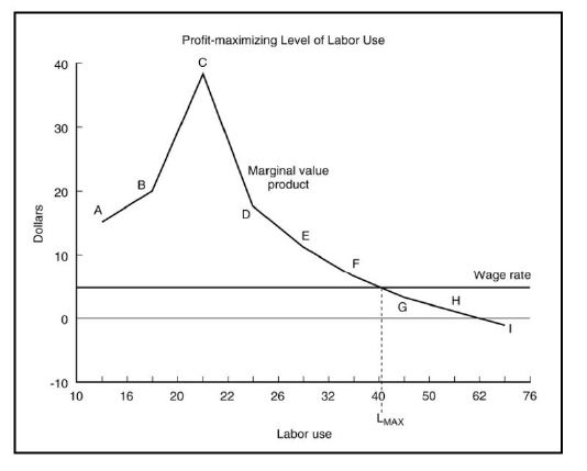
Given the graph below, the firm would maximize its profit by employing labor to the point where ________ equals ________.
During what season do mares begin to cycle?
a. Fall c. Winter b. Summer d. Spring
What is the color of the cables for the 12 volt auxiliary battery?
A) Blue B) Red or black C) Orange D) Yellow
New caliper piston seals should be lubricated with:
A. clean brake fluid. B. silicone grease. C. petroleum jelly. D. either B or C.