Aggregate demand and supply curves have been widely used to analyze the performance of the macroeconomy. Figure 5-3 shows four diagrams that represent different changes in the macroeconomy. Choose the diagram that best represents the situations described in the following questions.Figure 5-3
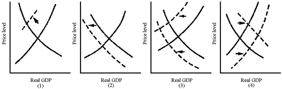
Which graph in Figure 5-3 best represents the supply-side shock of the 1970s oil crisis?
A. 1
B. 2
C. 3
D. 4
Answer: A
You might also like to view...
From 1980 to 2000 the labor force participation rate generally ________ and from 2000 to 2014 the rate generally ________
A) increased; decreased B) decreased; decreased C) increased; increased D) decreased; increased
Which of the following is rival and excludable?
A) a public good B) a natural monopoly C) a private good D) a common resource
U.S. gross domestic product is converted to U.S. gross national product by
a. adding the value of output produced by U.S.-owned resources in foreign countries. b. subtracting the value of output produced by U.S.-owned resources in foreign countries. c. subtracting the value of output produced in the United States by foreign-owned resources. d. both adding the value of output produced by U.S.-owned resources in foreign countries AND subtracting the value of output produced in the United States by foreign-owned resources.
In the long run, fixed costs are
A) sunk. B) avoidable. C) larger than in the short run. D) not included in production decisions.