Provide an appropriate response. Shortly before a mayoral election, a market research firm took a poll to find out which candidate people were planning to vote for. The results are shown below. 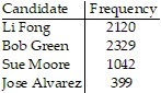 You wish to construct a graph to represent the data. It should be easy to see from your graph which candidate is in the lead. Which graph would be more useful, a bar graph or a pie chart? Explain your thinking.
What will be an ideal response?
Answers will vary. Possible answer: A bar graph would be more useful. A bar graph is useful for comparing the sizes of different categories with each other, since it is easy to compare the heights of different bars.
Mathematics
You might also like to view...
Complete the magic (addition) square.Use each number 34, 35, 36, 37, 38, 39, 40, 41, and 42 once.
A. 
B. 
C. 
D. 
Mathematics
Use synthetic division to find the quotient.(-6x3 + 2x2 + 5x - 10) ÷ (x - 2)
A. -6x2 - 10x - 5 + 
B. -6x2 - 10x - 15 + 
C. -6x2 - 10x - 25 + 
D. -6x2 - 10x - 15 + 
Mathematics
Simplify the expression. Assume that all variables are positive. ?
? 
A. x8/81
B. 
C. x
D. x8/9
Mathematics
Determine whether the statement is true or false.The function f(x) =  has a horizontal asymptote of y = -1.
A. True B. False
Mathematics