Refer to the information provided in Figure 13.1 below to answer the question that follows.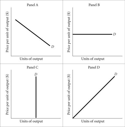 Figure 13.1Refer to Figure 13.1. Of the following choices, Panel A best represents the demand curve for
A. an individual producer of soybeans.
B. insulin.
C. a utility company.
D. none of the above
Answer: C
You might also like to view...
When the price of candy bars decreased from $0.55 to $0.45, the quantity demanded changed from 19,000 per day to 21,000 per day. In this price range, the price elasticity of demand (based on the midpoint formula) is
A. -0.5. B. -0.2. C. -1. D. -2.
Suppose product price is $24; MR = MC at Q = 200; AFC = $6; AVC = $16 . What do you advise this competitive price-taker firm to do?
a. Increase output. b. Decrease output. c. Shut down operations. d. Stay at the current output; the firm is earning a profit of $400. e. Stay at the current output even though the firm is losing $200.
Monetary neutrality is
What will be an ideal response?
Exhibit 4-3 Supply and demand curves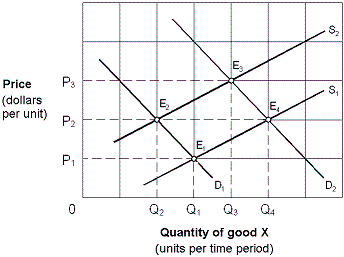 Initially the market shown in Exhibit 4-3 is in equilibrium at P3, Q3 (E3). Changes in market conditions result in a new equilibrium at P2, Q2 (E2). This change is stated as a:
A. decrease in demand and an increase in supply. B. decrease in demand and a decrease in quantity supplied. C. decrease in quantity demanded and an increase in quantity supplied. D. decrease in quantity demanded and an increase in supply.