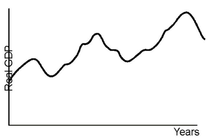
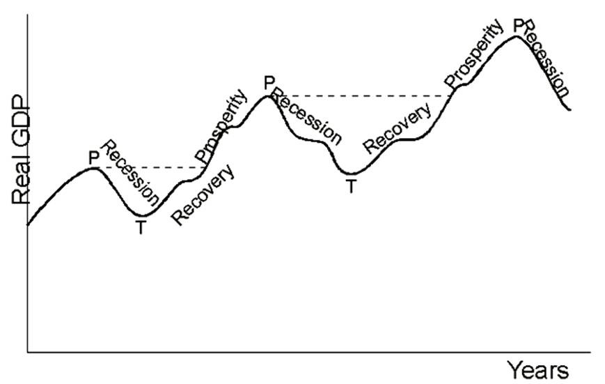
Label the graph above with respect to the three phases of the business cycle and the cycle turning points.
You might also like to view...
Deadweight loss from monopoly power is expressed on a graph as the area between the
A) competitive price and the average revenue curve bounded by the quantities produced by the competitive and monopoly markets. B) competitive price line and the marginal cost curve bounded by the quantities produced by competitive and monopoly markets. C) competitive price line and the monopoly price line bounded by zero output and the output chosen by the monopolist. D) average revenue curve and the marginal cost curve bounded by the quantities produced by competitive and monopoly markets.
The difference in present value between a perpetuity that promised $1 per year starting today and one that promised $1 per year starting next year is
a. 0. b. $1. c. $1/(1 + r). d. $r/(1 + r).
The size of the marginal propensity to consume determines the size of
a. government spending in the economy. b. the multiplier. c. planned investment in the economy. d. None of these.
Exhibit 14A-2 Macro AD-AS Model
 In Exhibit 14A-2, the long-run aggregate supply curve represents:
A. potential real GDP output for this economy. B. that the economy is experiencing zero inflation. C. that the economy is experiencing technological change. D. the level of real GDP where the unemployment rate is zero.