Use the above figure. This graph is known as
A) the Laffer curve.
B) the short-run Phillips curve.
C) the NAIRU relationship.
D) the Keynesian curve.
B
You might also like to view...
Refer to Price Ceiling. After the price ceiling is imposed, consumers' surplus is equal to
The following questions refer to the accompanying diagram which shows the effects of a price ceiling. The initial price and quantity are P0 and Q0, respectively, and the price ceiling is imposed at the price P1. Assume that none of the potential deadweight loss can be avoided.
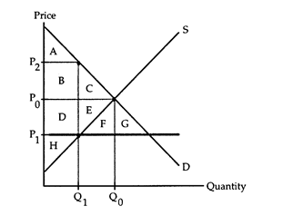
a. area A.
b. area A + B.
c. area A + B + D.
d. area A + B + C + D + E + F + G.
In monopsonistic markets, workers are paid less than their
a. MRP b. MLC c. wage rate d. marginal product e. marginal revenue
If actual output exceeds potential output for a prolonged period of time, we would eventually expect factor prices to:
A. fall, causing the LAS curve to shift in to the left. B. fall, causing the SAS curve to shift down (to the right). C. rise, causing the SAS curve to shift up (to the left). D. rise, causing the LAS curve to shift out to the right.
Which of the following reasons promoted lending to the poorer member countries in the European Union during 2001-2007?
A. The investment in human capital in the poorer countries was higher than the investment in the richer countries. B. The long-term interest rates in the poorer countries were as low as the interest rates in the richer member countries. C. The debt to GDP ratio was much lower in the poorer countries than in the richer countries. D. The poorer countries experienced lower rates of inflation than the richer countries.